Era Labs
Era builds the intelligence layer for physical devices.
They partner with companies making physical products, combining real-time inputs, memory, and custom behavior so each object can listen, respond, and act in its own way.
But what they're really building toward is less tangible: a world where technology feels less present in your life.
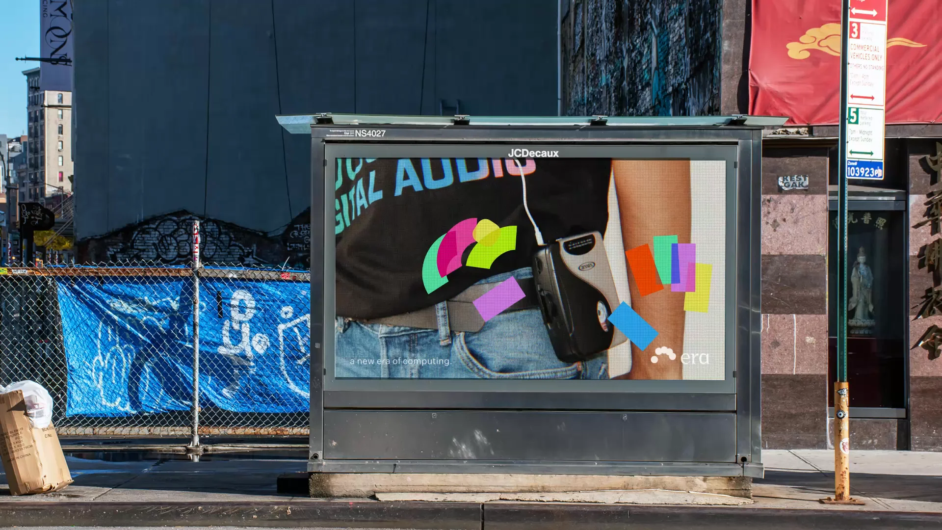
Cotton was tasked with creating a brand identity that lives beyond the screen and adapts to each physical context, breathing differently with every collaboration.

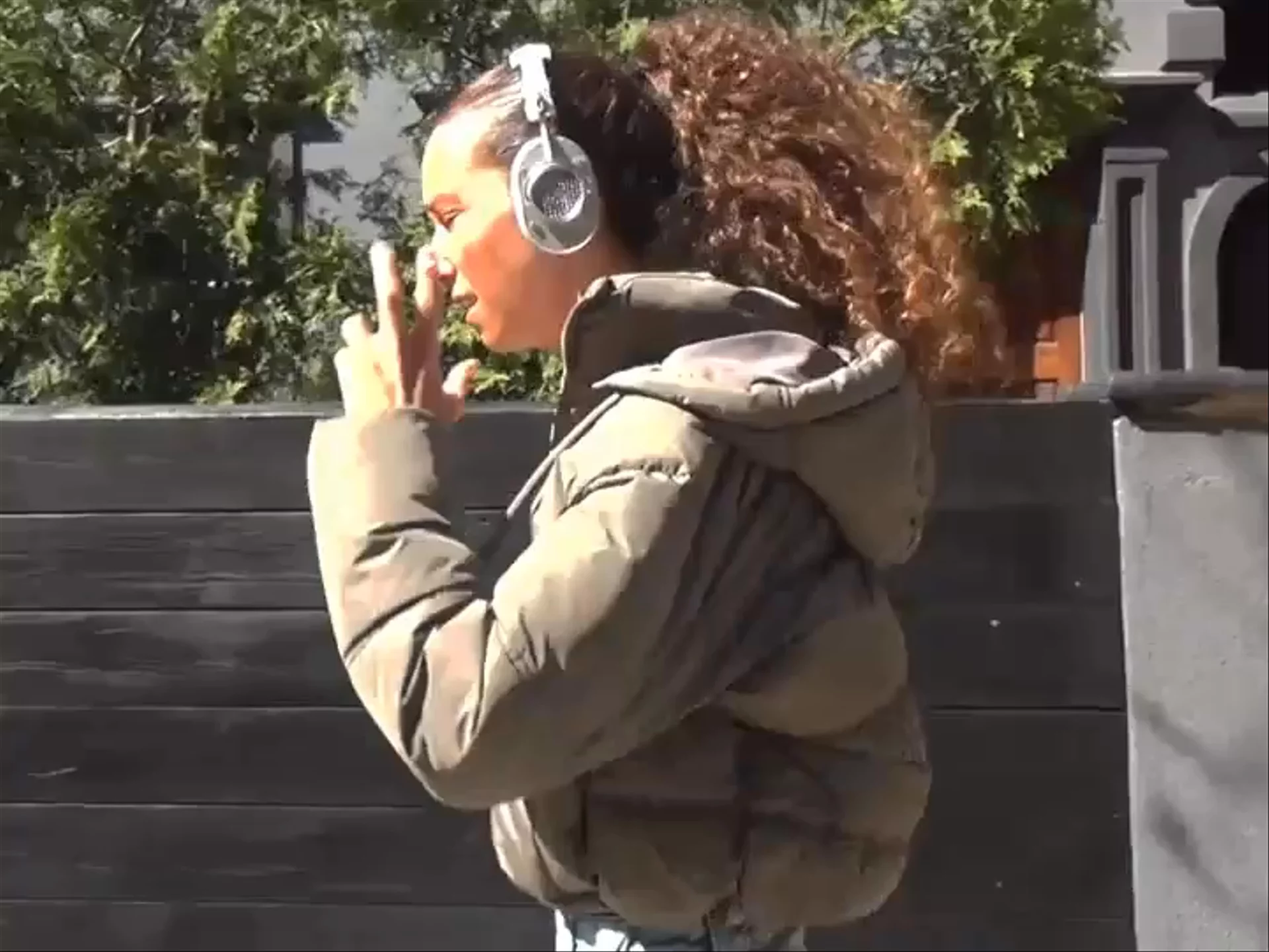
“Digital is just not it.” Influencers weigh in on the state of technology.
Era builds the intelligence layer for any physical object, building toward a world where technology feels less present.
“What if the most intelligent objects in your life were also the ones you loved the most?”
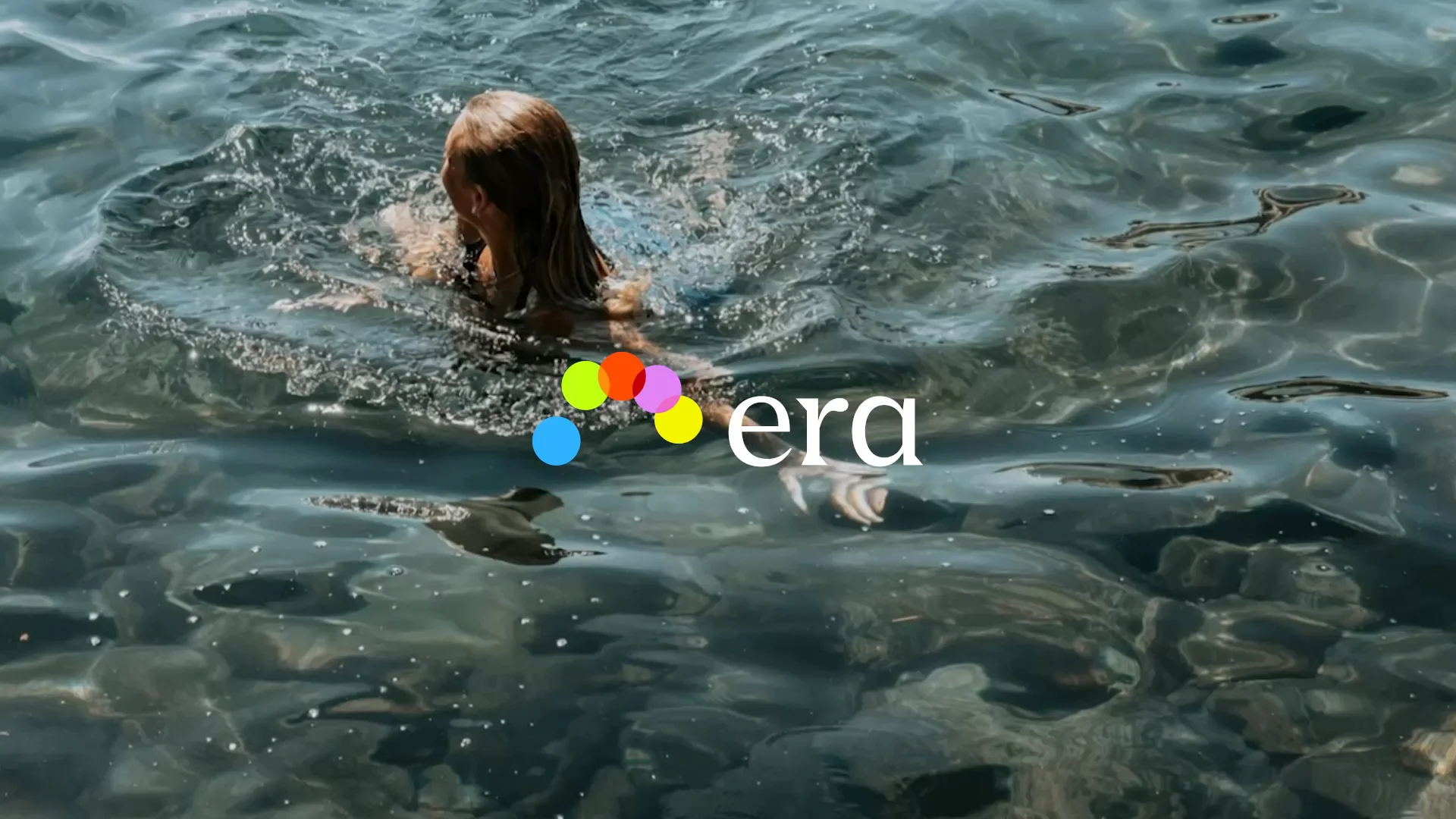


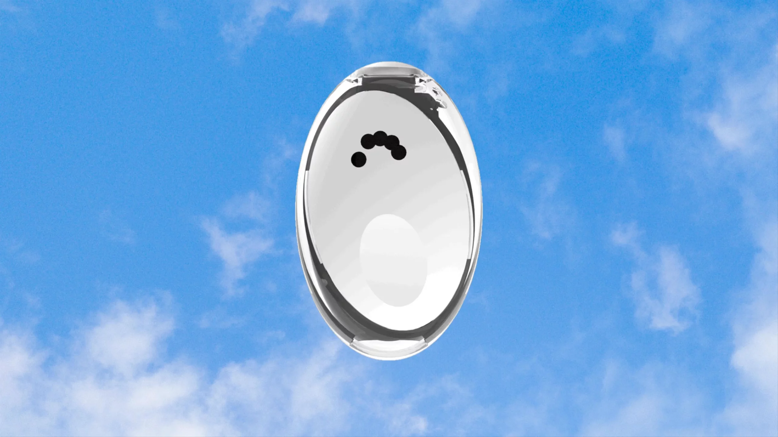
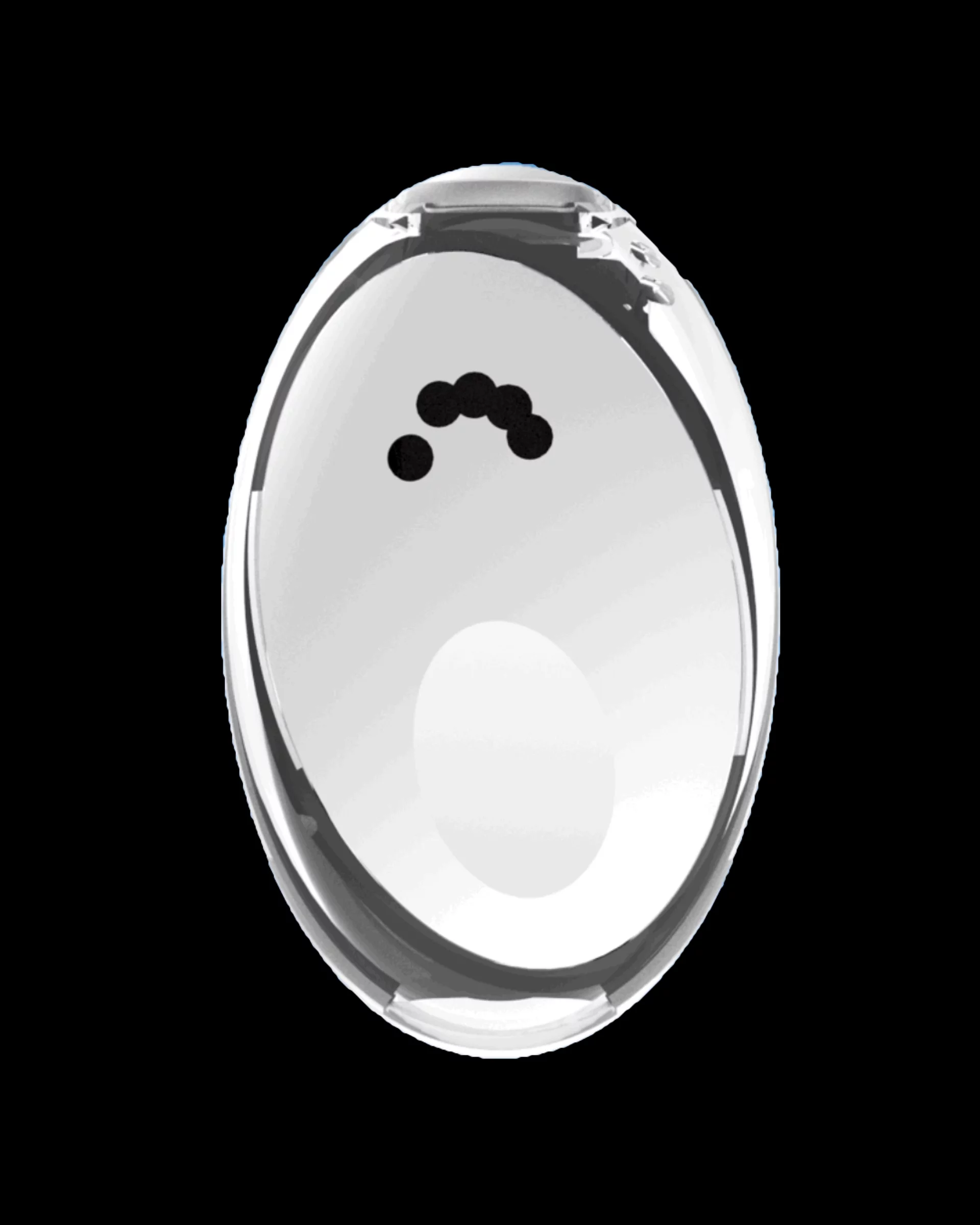
The logo evokes five fingers resting on a physical plane, then optimized for graphic precision.

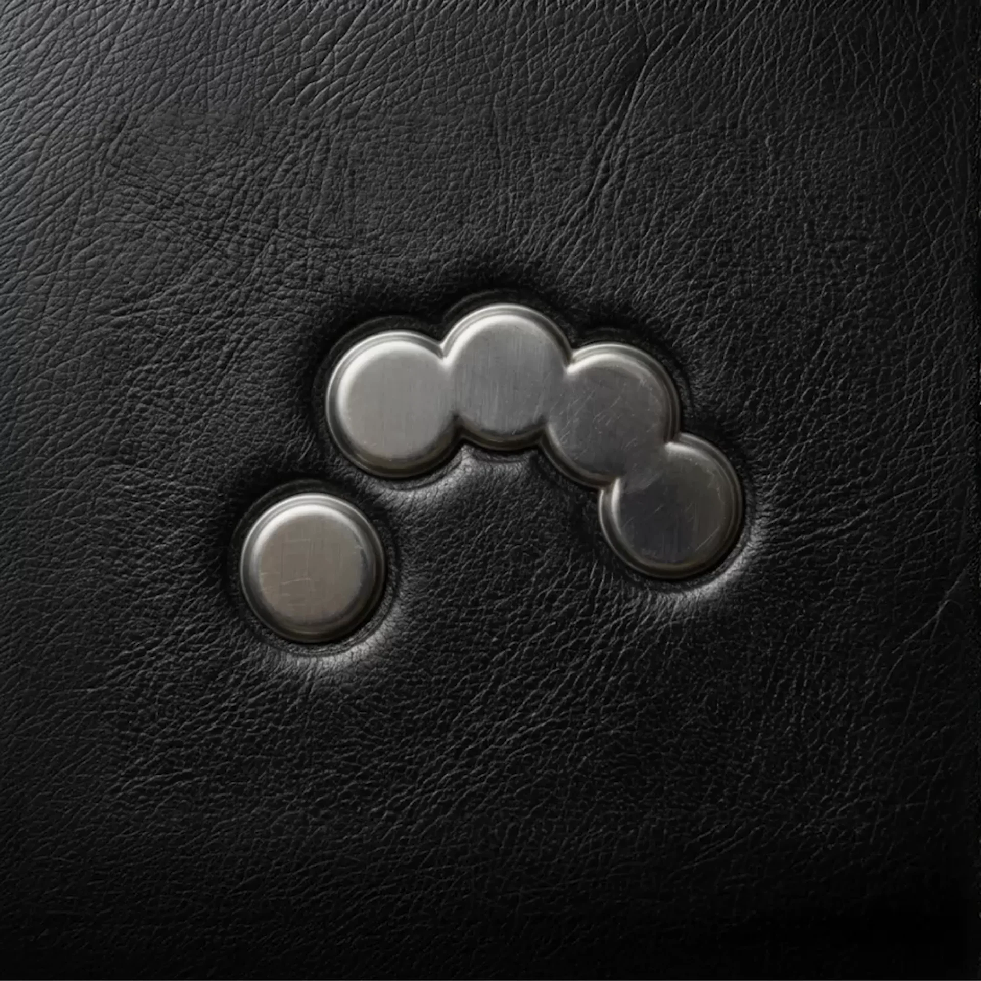
Flexible options for color—and material

Color

A color palette inspired by 4th gen iPod Shuffle (2010) colors

Instead of blending colors with "Multiply", a custom swatch was defined for every two-color combination, adding tactility to the resulting mix.
Logo Behavior
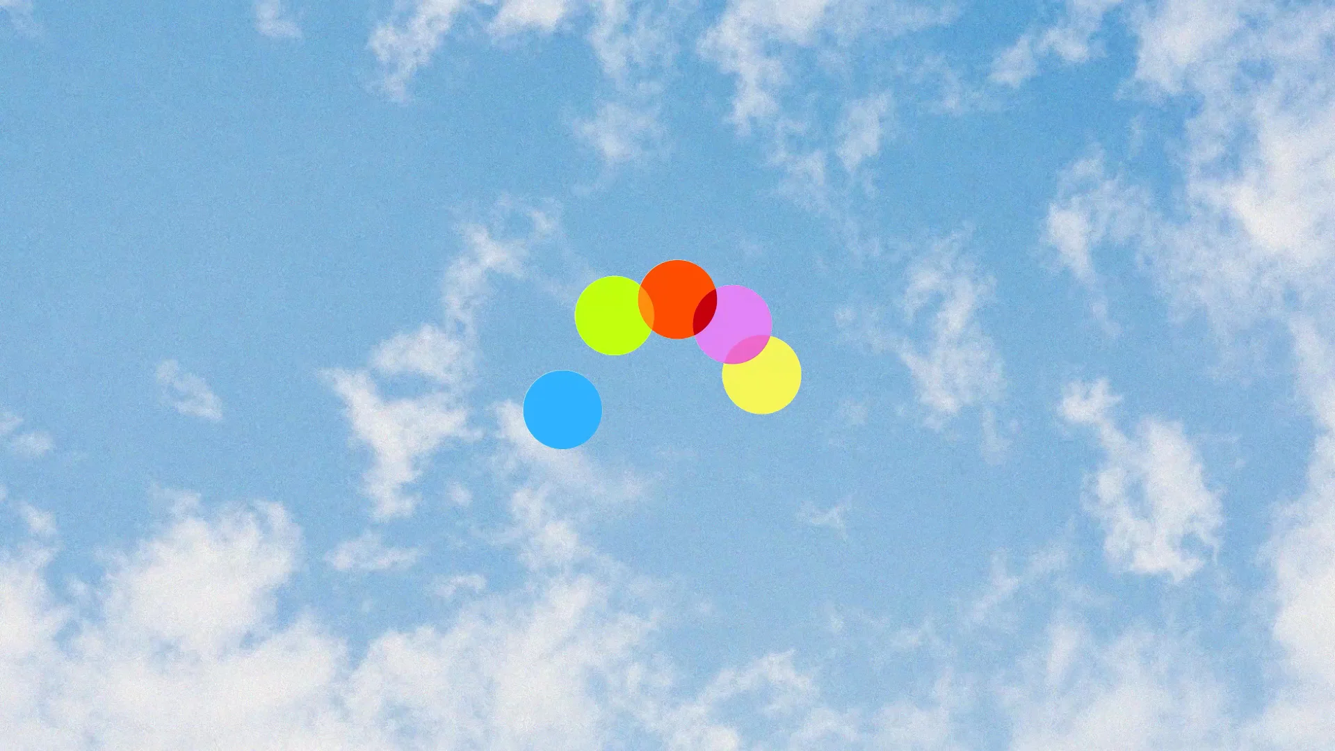
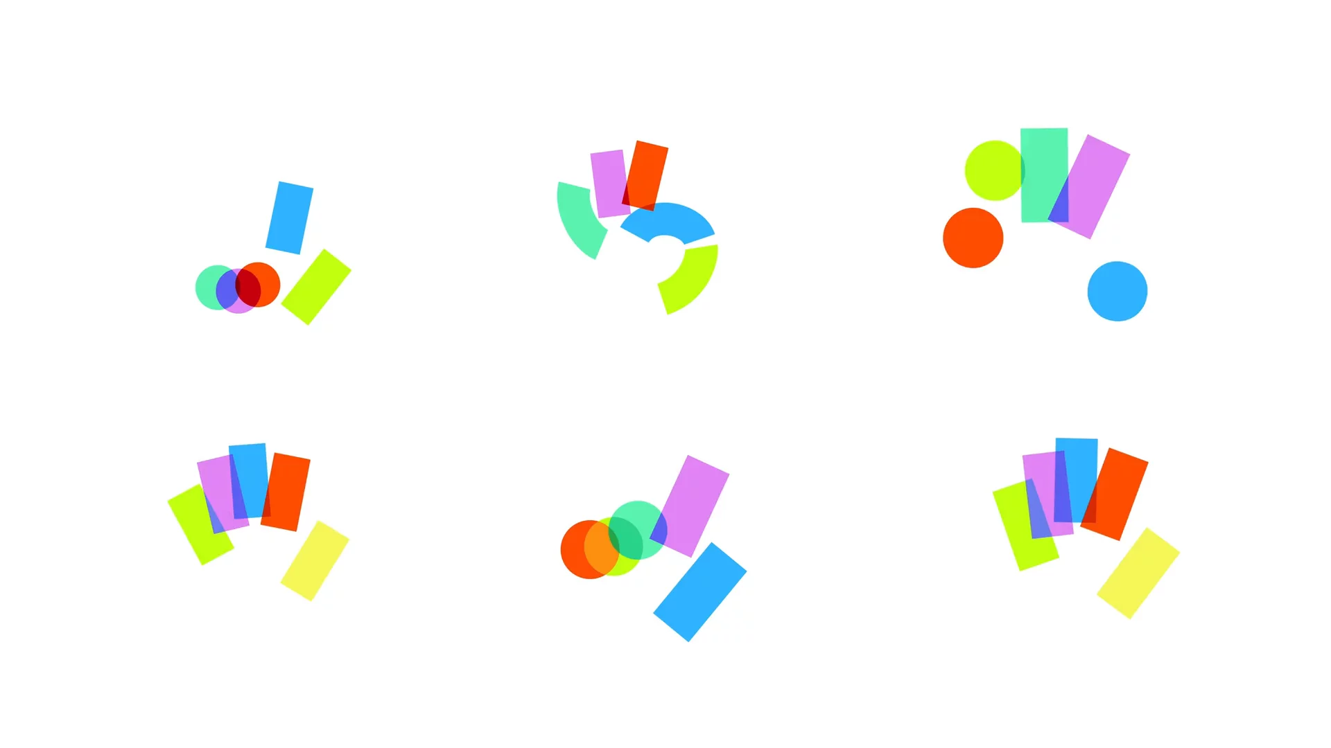
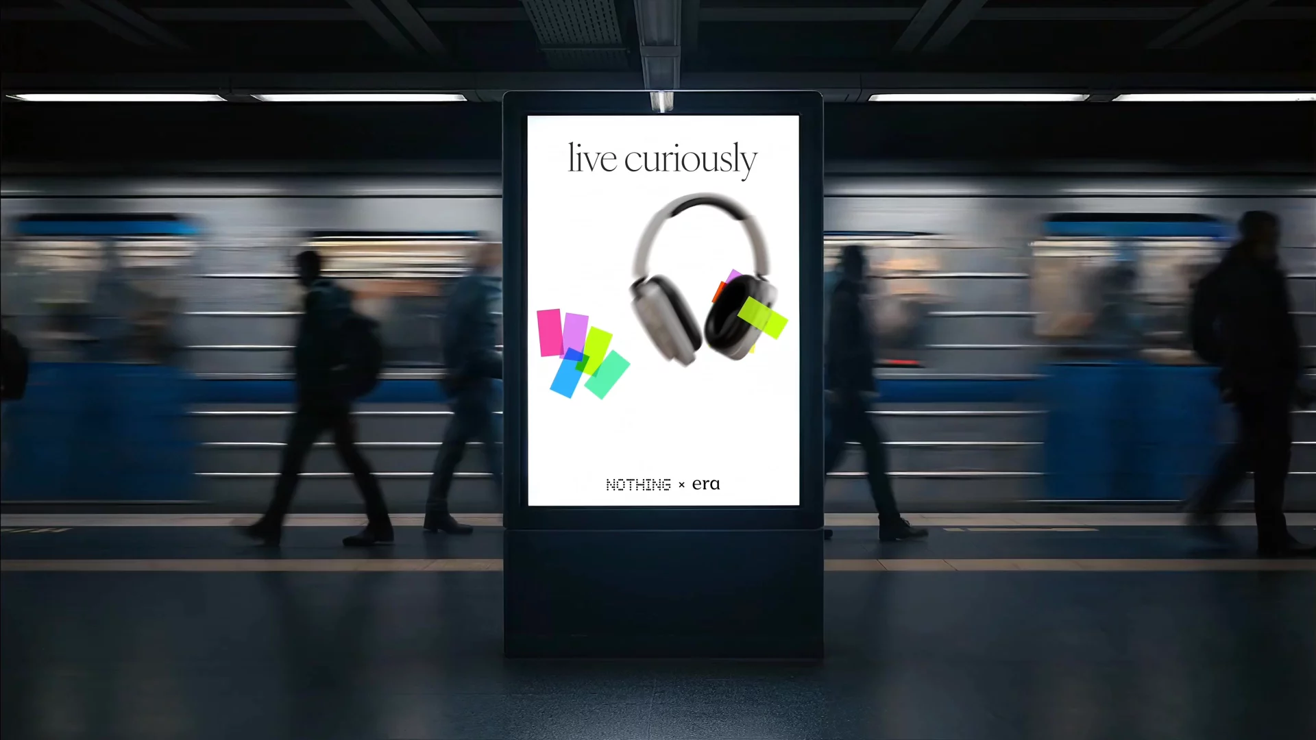
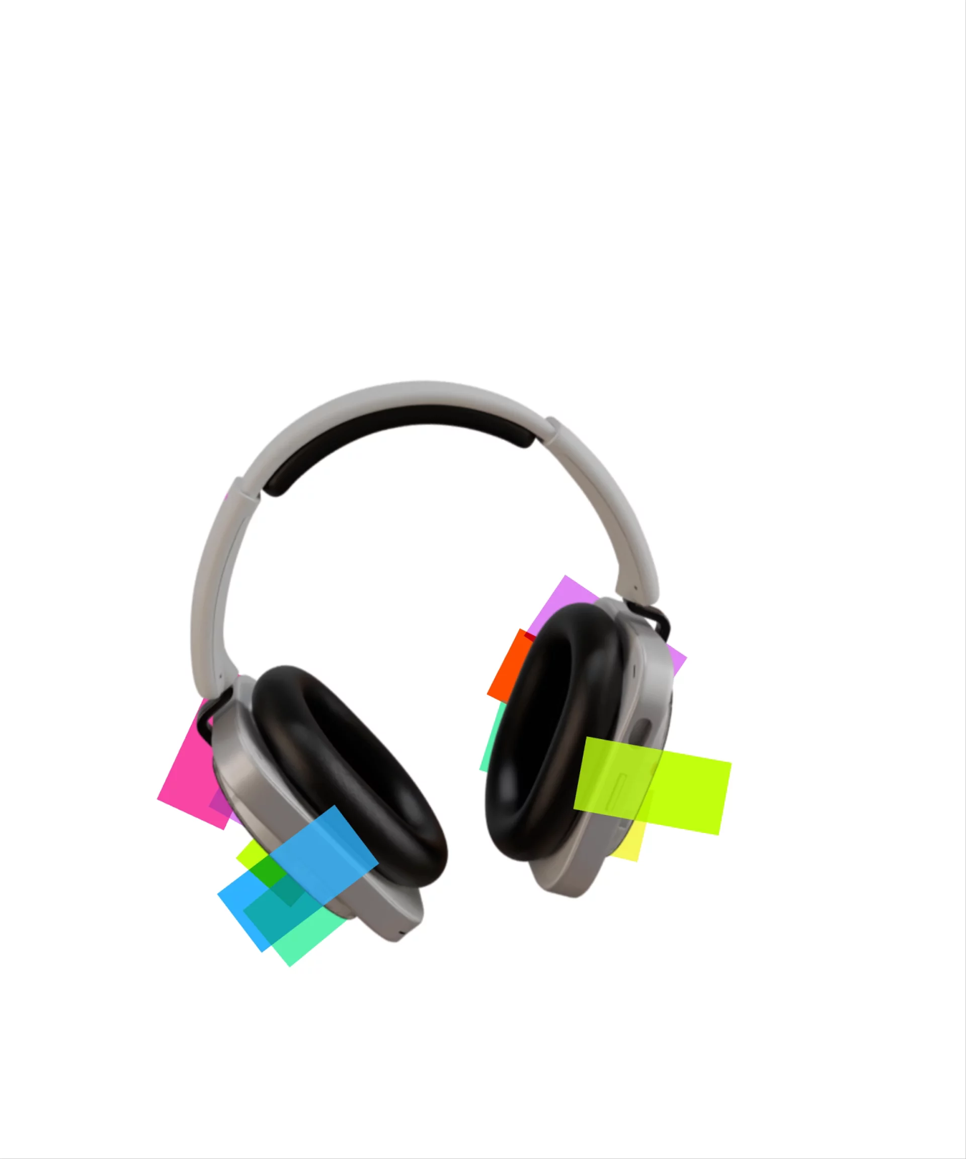
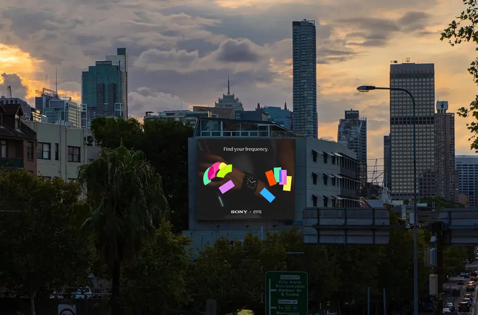

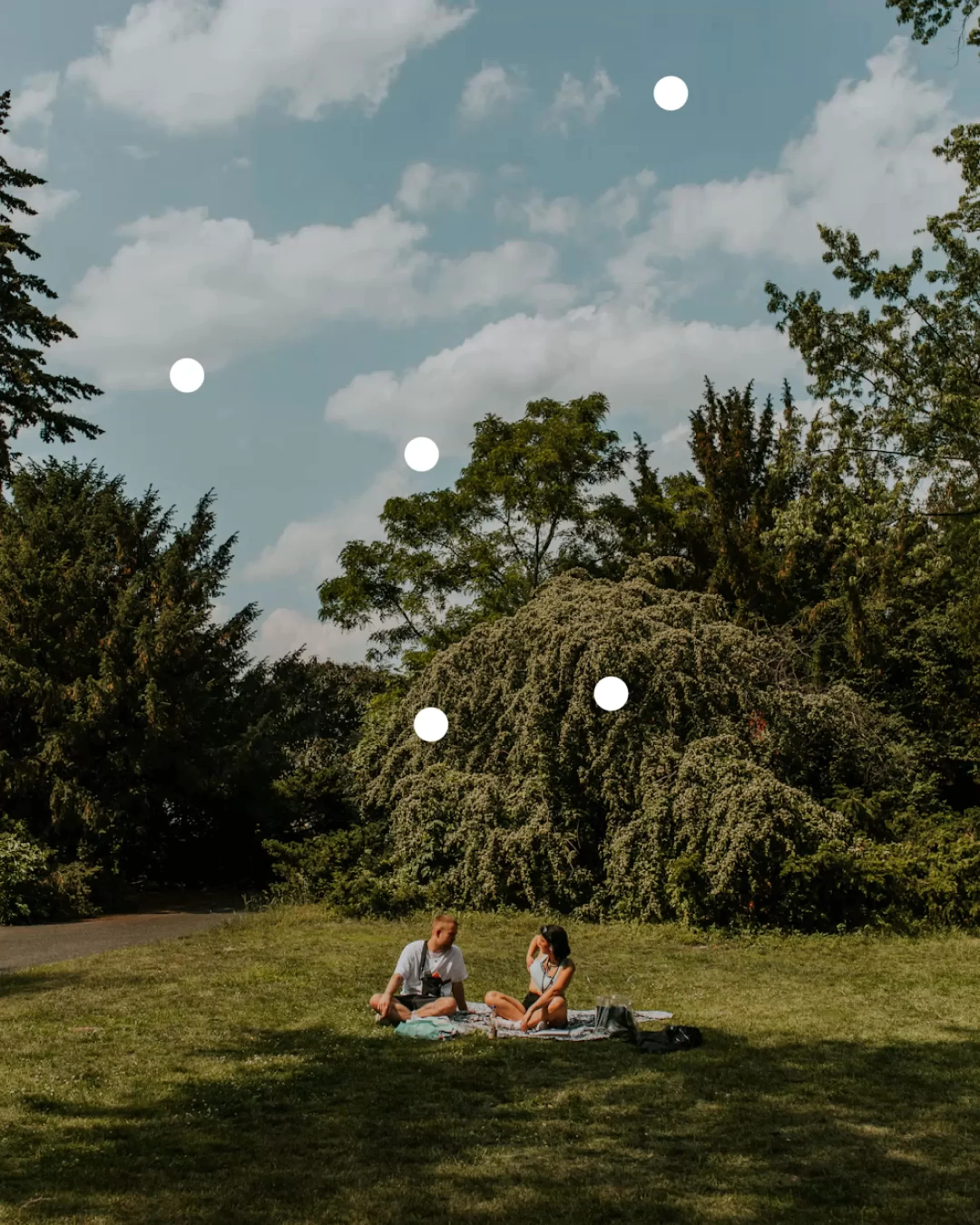
How the logo breathes across products


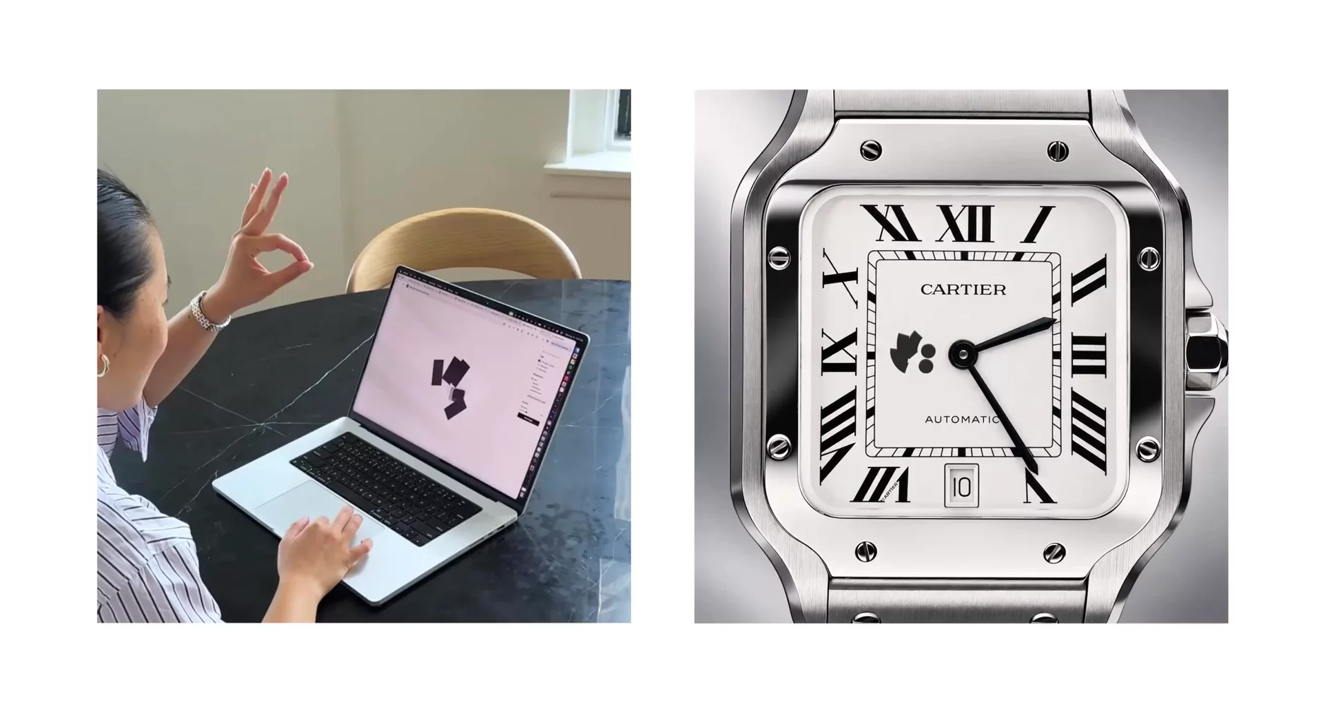
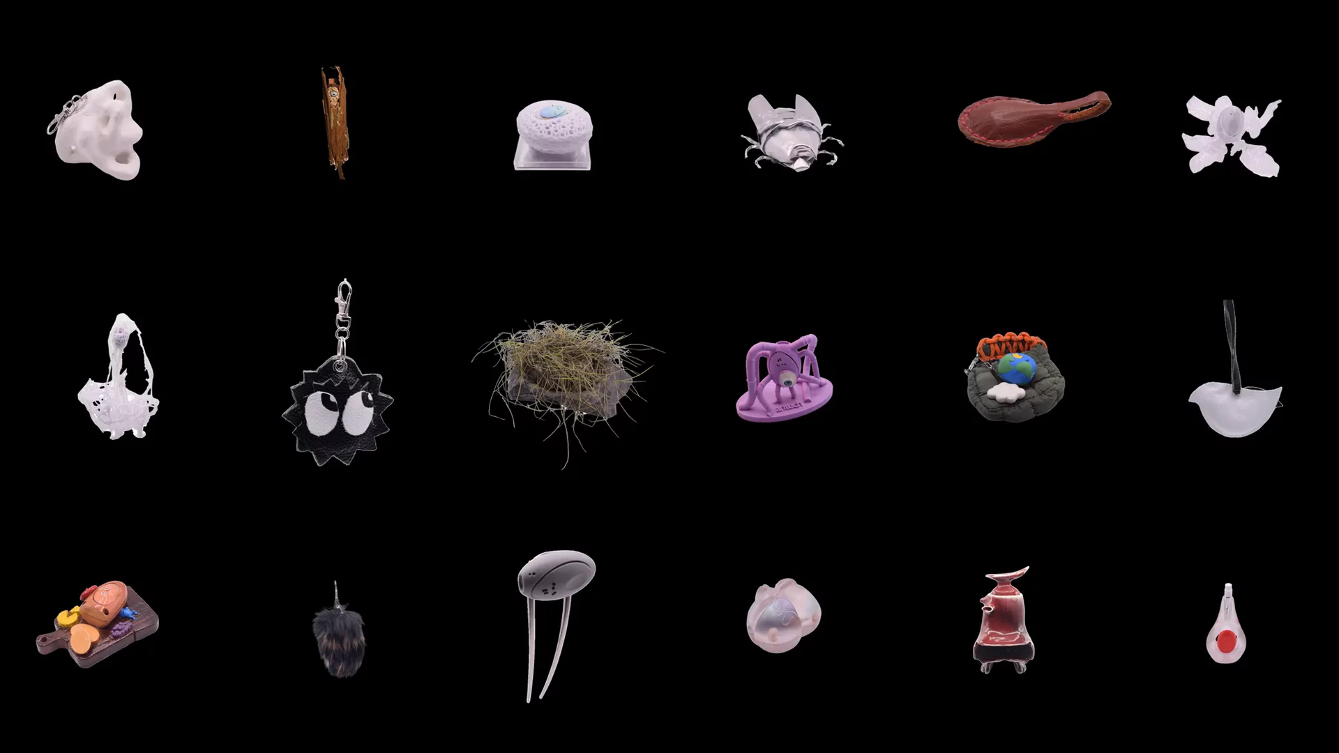
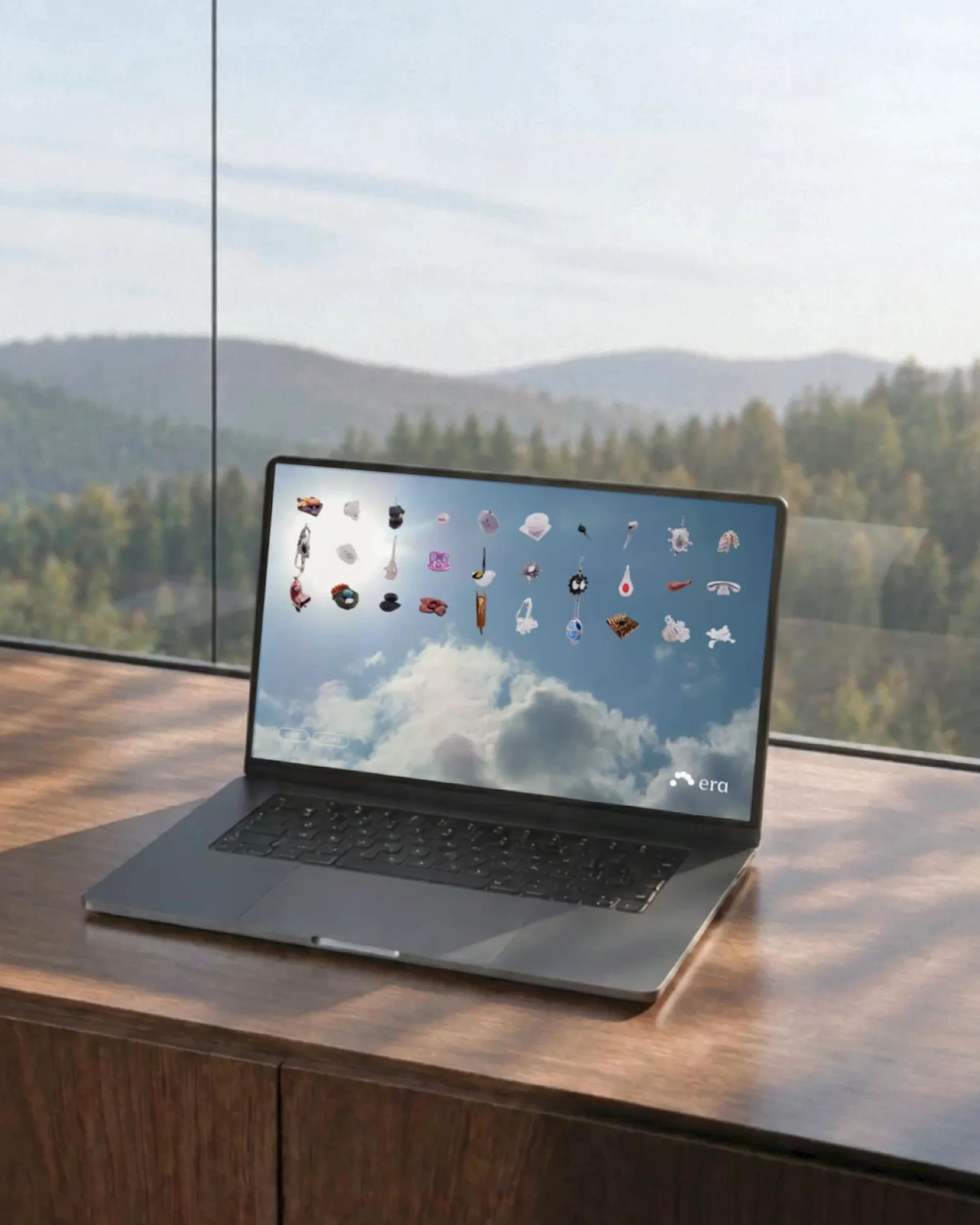
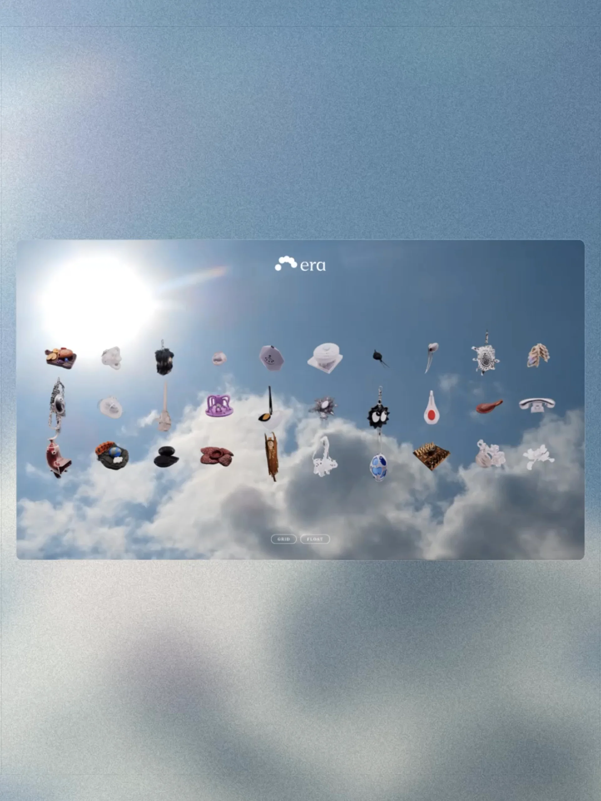
Each partnership is represented by a unique mark – generated by the partner to their ethos.
How It Works
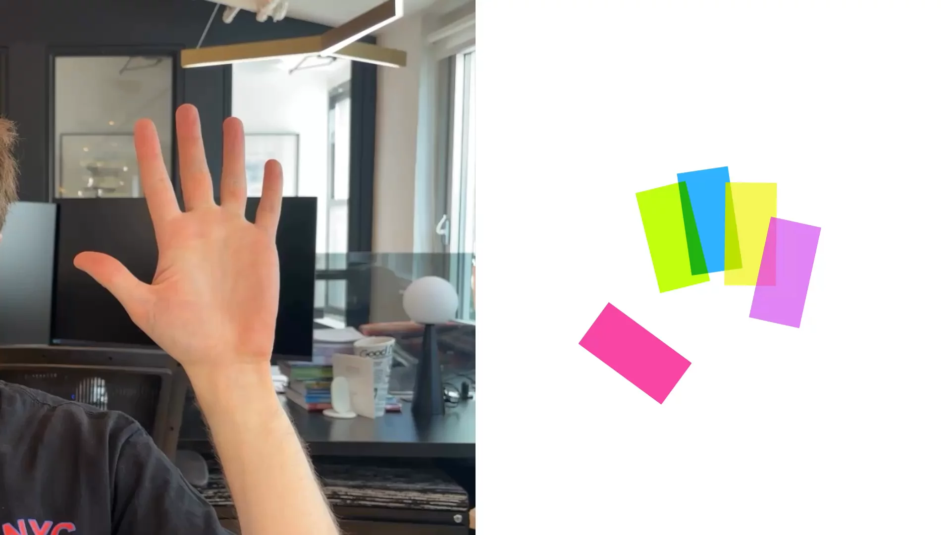
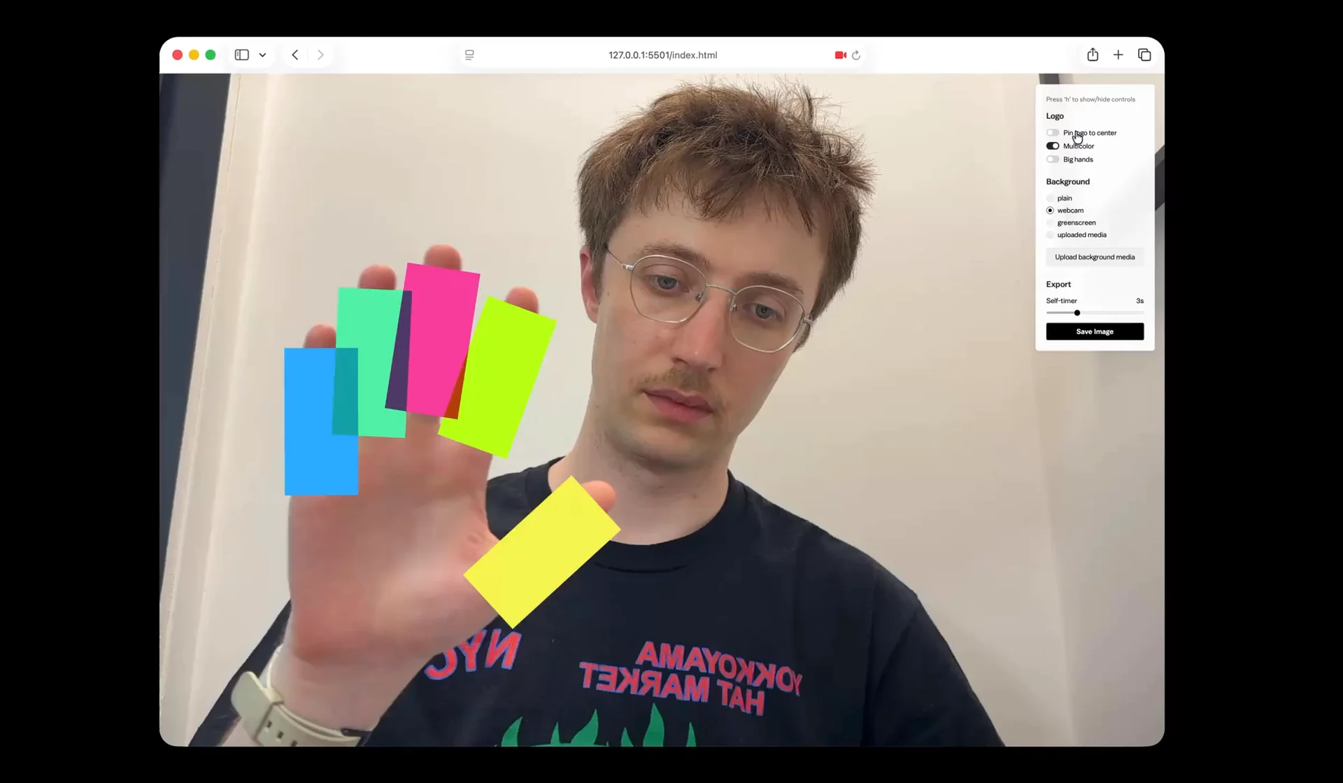
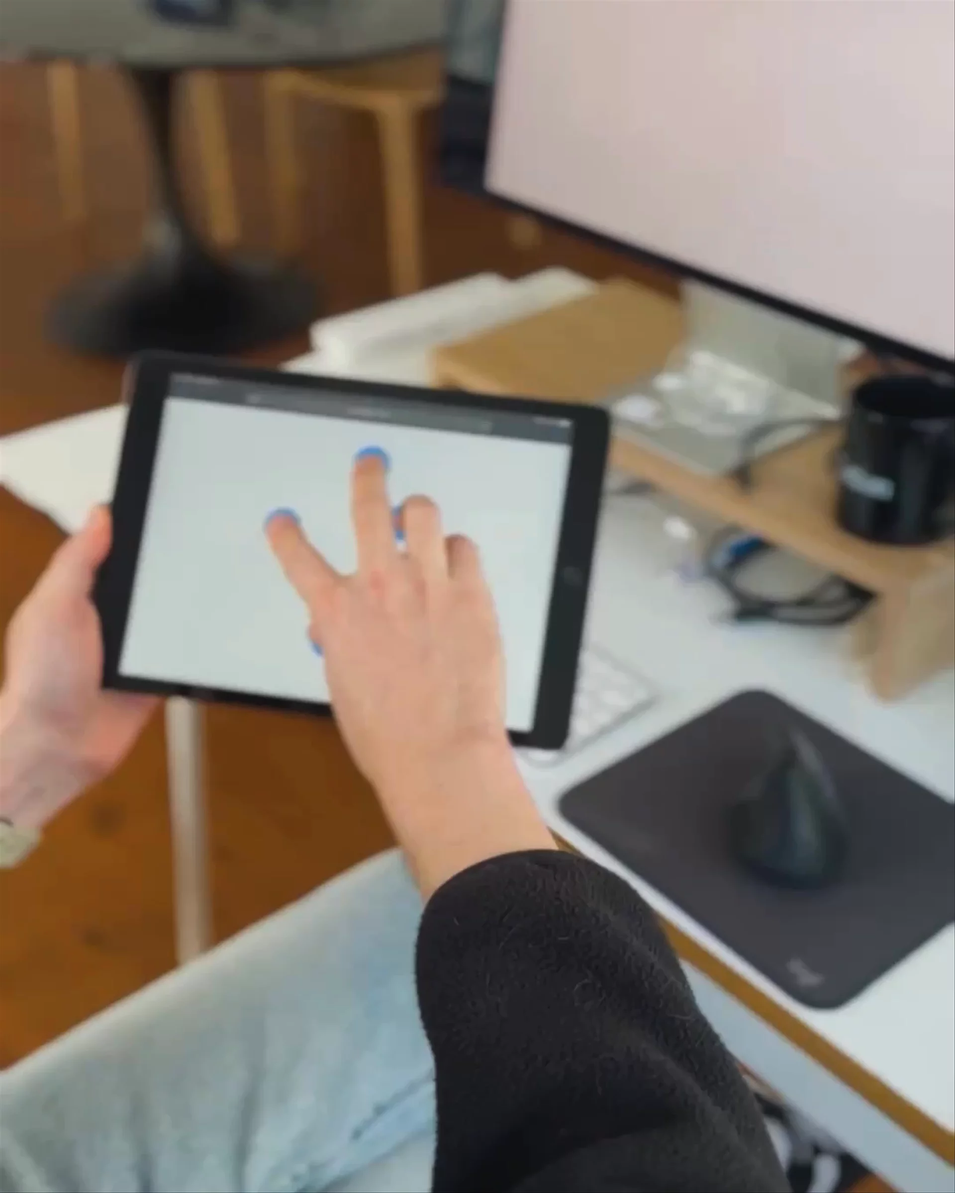
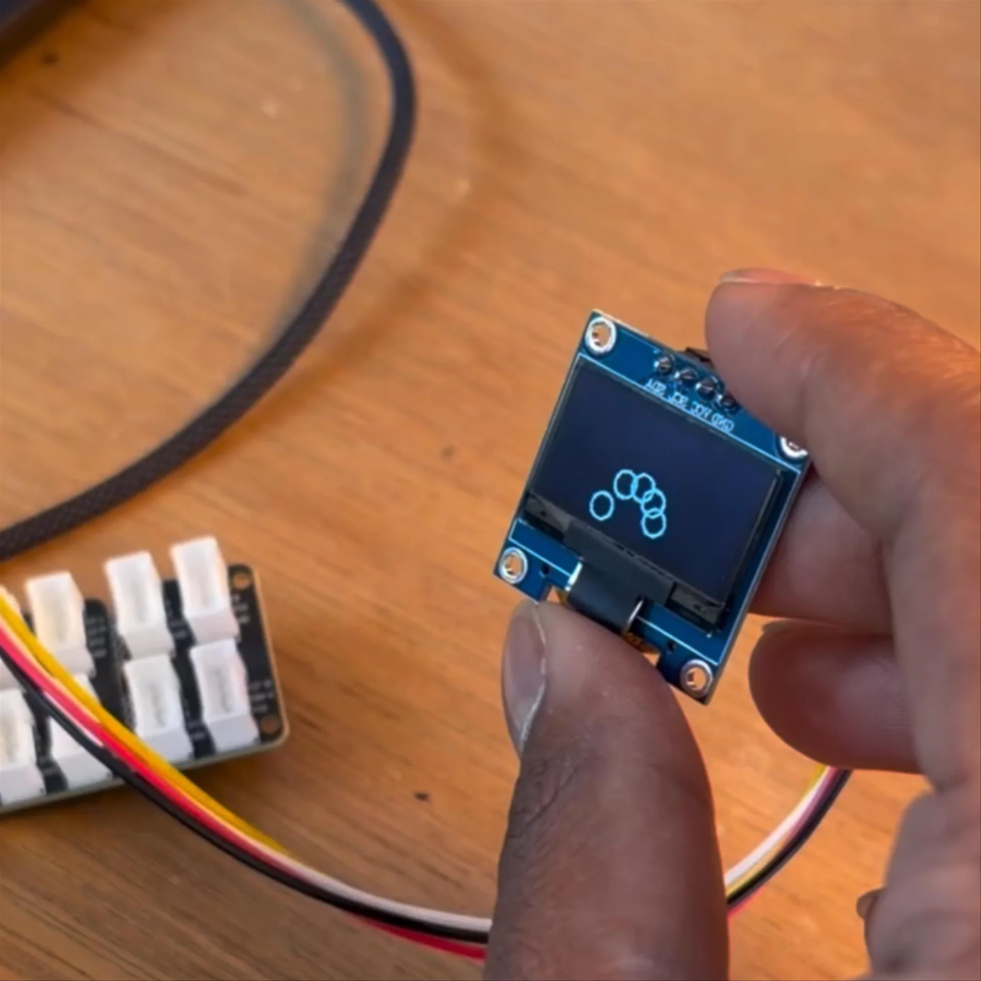
The recurring five-dot motif is a literal reflection of a hand on a physical material; to make it would be impossible without physical touch.
Lockup Ecosystem





Project Team
- Talia CottonCreative Director/Technology Director
- Noah SchwadronLead Designer & Coder
- Dev Makker3D Motion Support
- Krithi NallaDesigner, Era