Dust Identity
Background
Dust Identity is a company at the intersection of technology and security for clients in both luxury goods and defense. Using diamond-dust technology to create unclonable markers, Dust ensures the authenticity and secure tracking of high-value products.
Landscape & Goals
Dust was looking to pivot from a tech-centric image to one more aligned with the luxury goods industry. As part of the process, we conducted a comprehensive competitive analysis of their direct landscape, as well as aspirational brands and those appealing to their target audience.
Our research encompassed luxury brands, art galleries, and reputable security companies to identify elements that would resonate with their new direction. Among other findings, simple wordmarks and authoritative seals we predominant.

Logo Evolution
We transformed Dust’s logo to align with luxury and collectible art brands while emphasizing its 3D characteristics to mirror the physicality of their products. The new logo functions as a seal of security on luxury goods, symbolizing the highest level of protection.


Interactivity
The interactive logo further underscores the theme of physicality. As the user moves through the website and digital applications, the logo transforms into a three-dimensional object, engaging users by allowing them to rotate and inspect it, much like verifying the authenticity of a luxury item. This interaction highlights the user's role in the brand experience, fostering a personal connection to the brand.
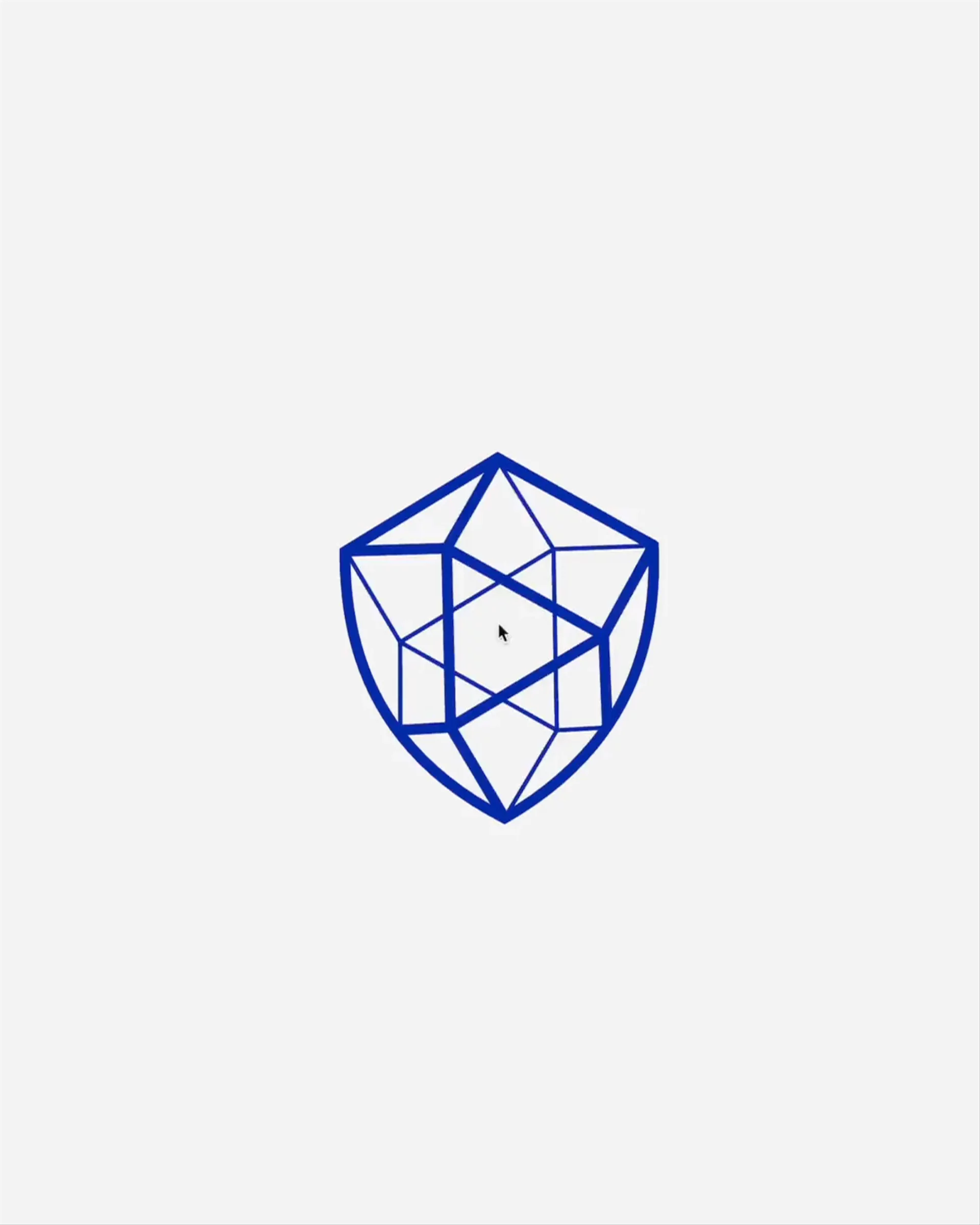
The logo's ability to change perspective around the user adds depth and symbolizes its tailored relationship with each individual.
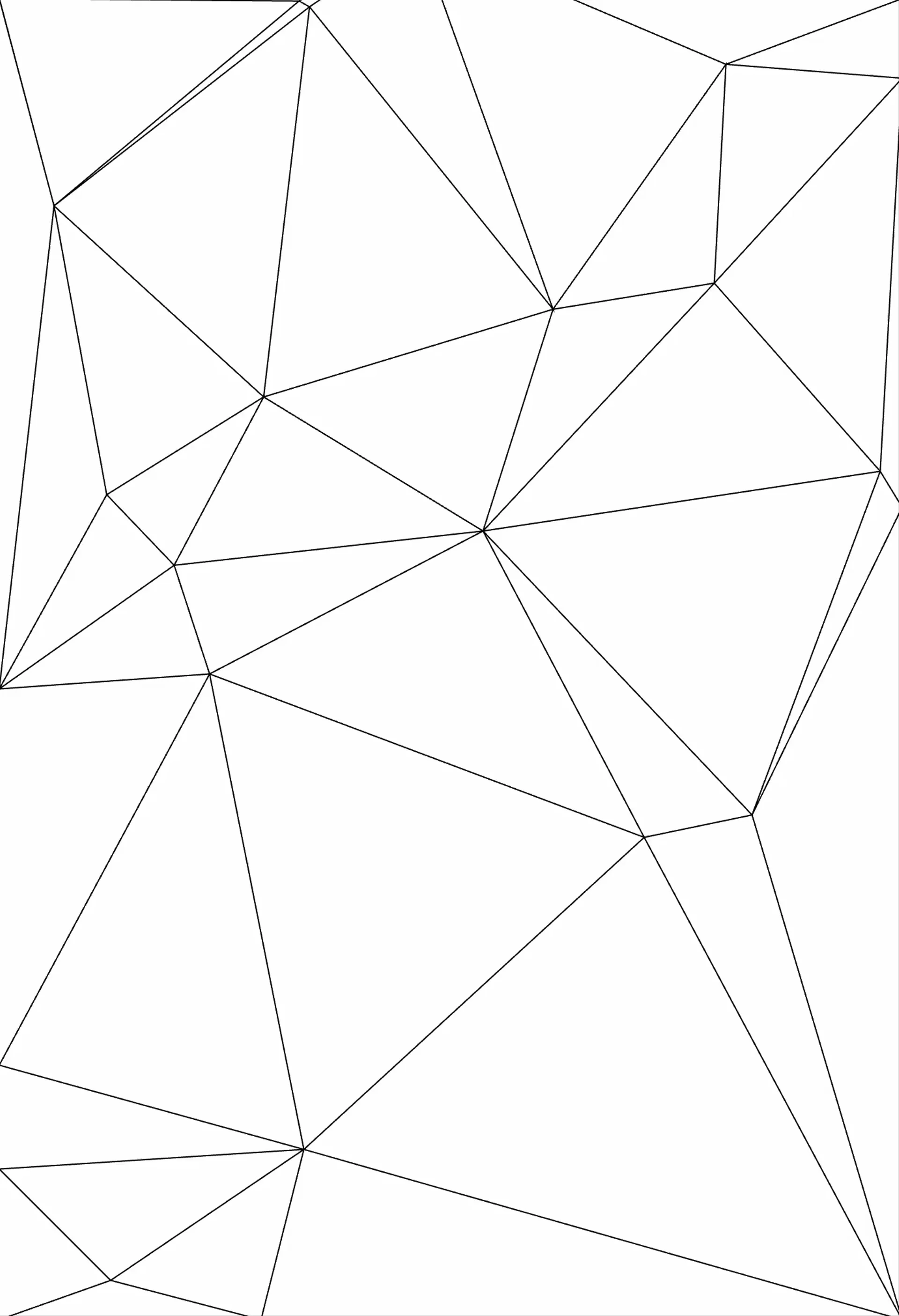
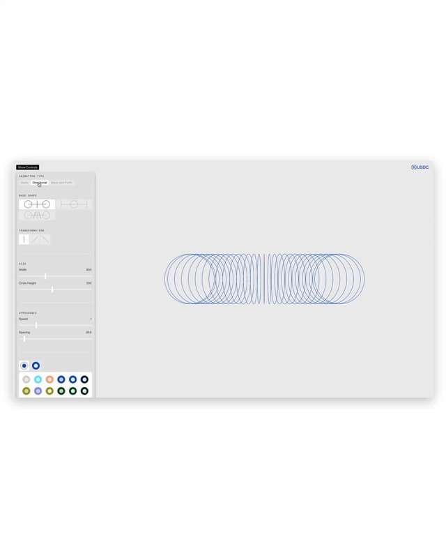
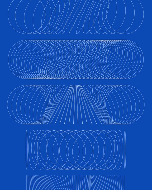
An interactive pattern modeled after the logo reinforces the brand’s visual identity.
Brand Elements


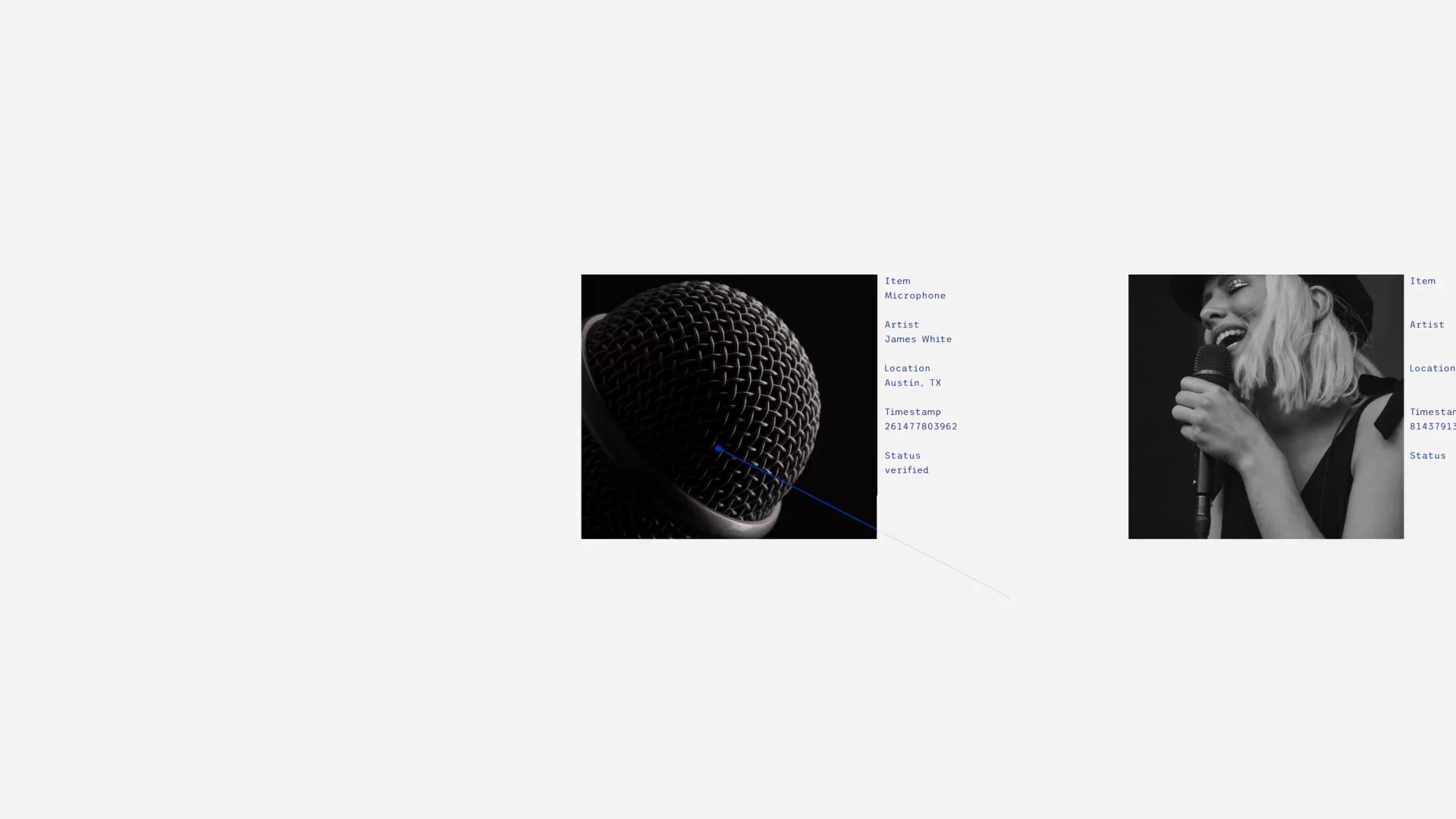
The photography direction captures the worn and intricate details of each item, bringing focus to the life and story behind each object.
Applications & In Use
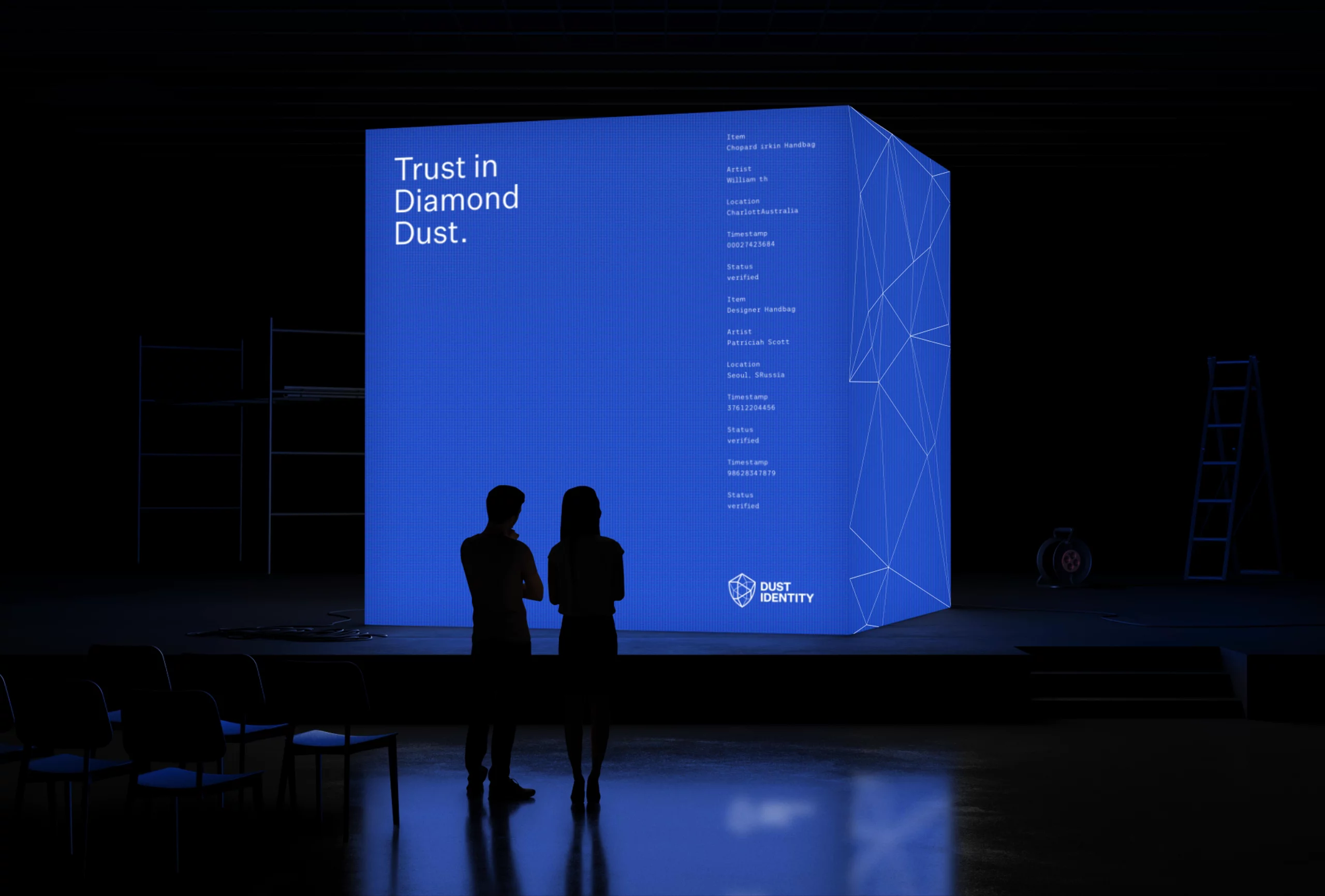
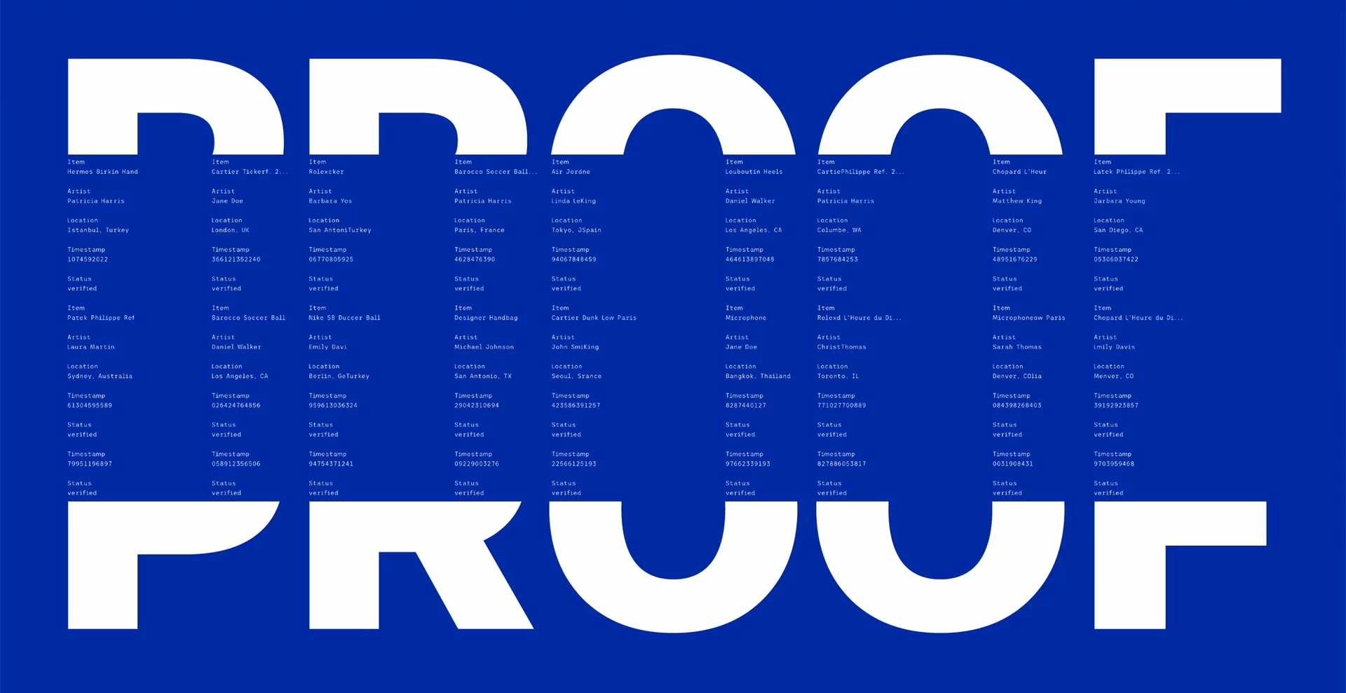
The rebrand features a minimal color palette centered around a deep royal blue, complemented by a collection of animated brand motifs and elements. Labels animate in a monospaced typeface, hinting at the technology behind the products, while a sans-serif font, Untitled Sans, imparts a sense of luxury. High-contrast, greyscale macro photography showcases the details of each object, giving them a story.


Journey

Project Team
- Talia CottonCreative Director
- Jake MasakayanDesigner
- Noah SchwadronDesigner
- Office Romance: Effie Speridakos & Andrew KleinCreative Agency Collab
