Yellow Technologies
Yellow Technologies is a rising innovator in AI technology, revolutionizing the creative landscape with advanced 3D AI tools designed for game developers, creative studios, and digital world builders. Founded by a team of Stanford researchers, the company integrates with platforms like Unity, Unreal, and Roblox, and is setting a new standard for 3D creation.
At the heart of Yellow's mission is a commitment to empowering creators with tools that enhance productivity while preserving artistic control and freedom. Addressing industry pain points such as topology-aware 3D generation, AI-accelerated sculpting, and pre-rigged animation, Yellow has developed solutions that streamline workflows and enable creators to scale their visions with unprecedented speed and precision. By tackling these challenges, Yellow ensures that its technology amplifies human creativity rather than replacing it.

Background
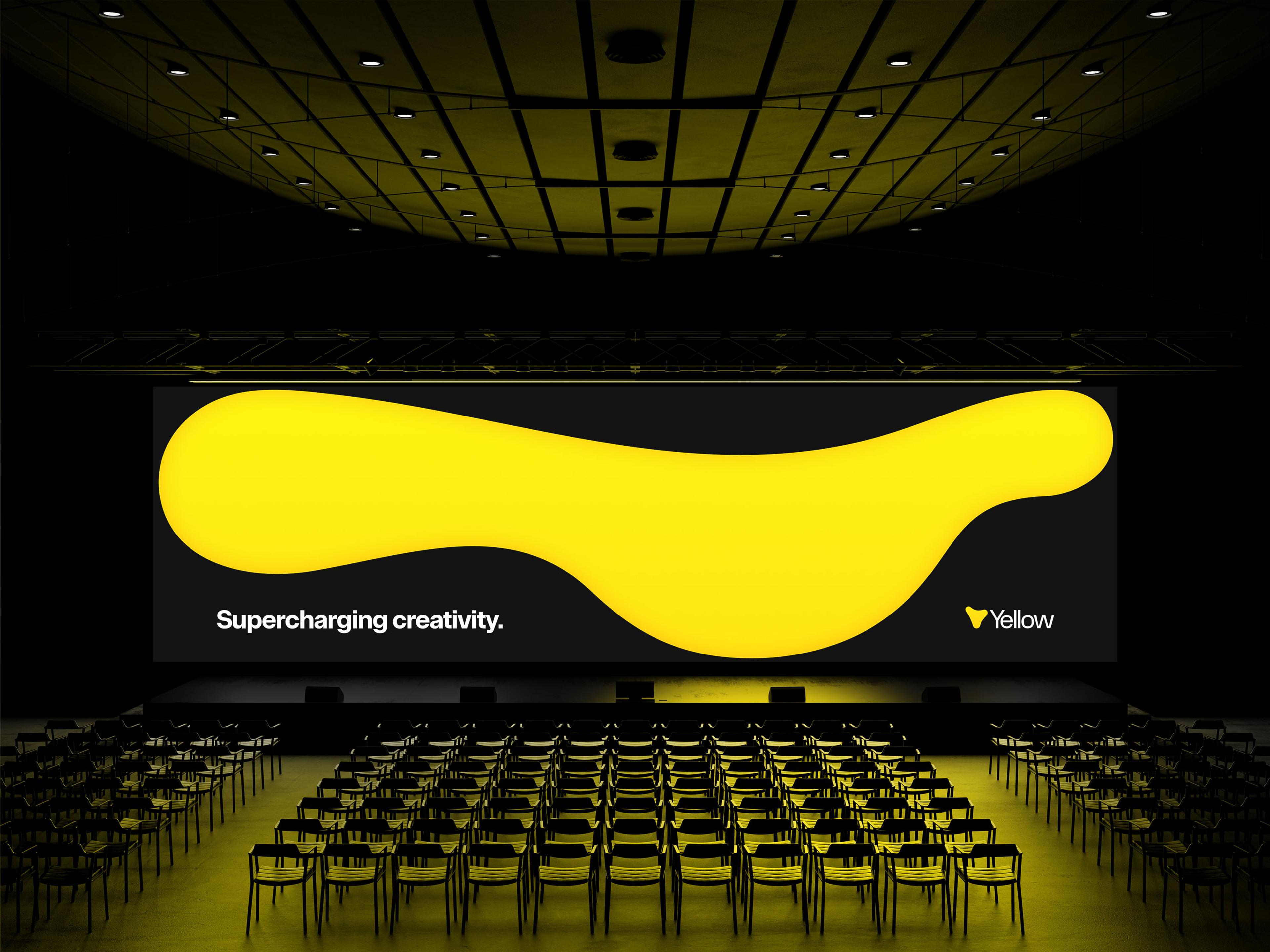
When it came to defining Yellow’s identity, strategy agency Dear Future took a forward-looking approach. Rather than focusing on the technological aspects—intentionally avoiding terms like "3D" and "AI"—the branding centered on the company’s transformative impact. The core message, "Supercharge creativity," became the foundation for the visual and strategic identity.
Cotton drew inspiration from the flexibility and limitless potential of clay: the original 3D medium. Just as clay can take any form, the visual identity was designed to be equally malleable—adaptable, dynamic, and unrestricted in its expression. This approach underscores Yellow’s ethos: a company not confined by tools or technology, but defined by its ability to empower creators to shape the future.

Logo
The logo is, at first glance, a big blobby yellow letter "Y". But its behavior says more. In motion, the Yellow logo appears to gently breathe through space, as if to say "play with me!" or "we can be anything!" Interactively, users can play with the logo like a wad of clay—stretching and shaping it as they please. Just as the technology is designed to respond to the needs of creators, the logo dynamically responds to the user’s movements, embodying the brand's human-centered approach.

Logo interactivity


Although "blobby" at first glance, the architecture of the Yellow logomark is constructed with physics in mind. Just as clay gets less and less dense the more it gets stretched out, the radius of each arm of the logo gets more and more narrow the further away from the center of the mark.
Visual Elements
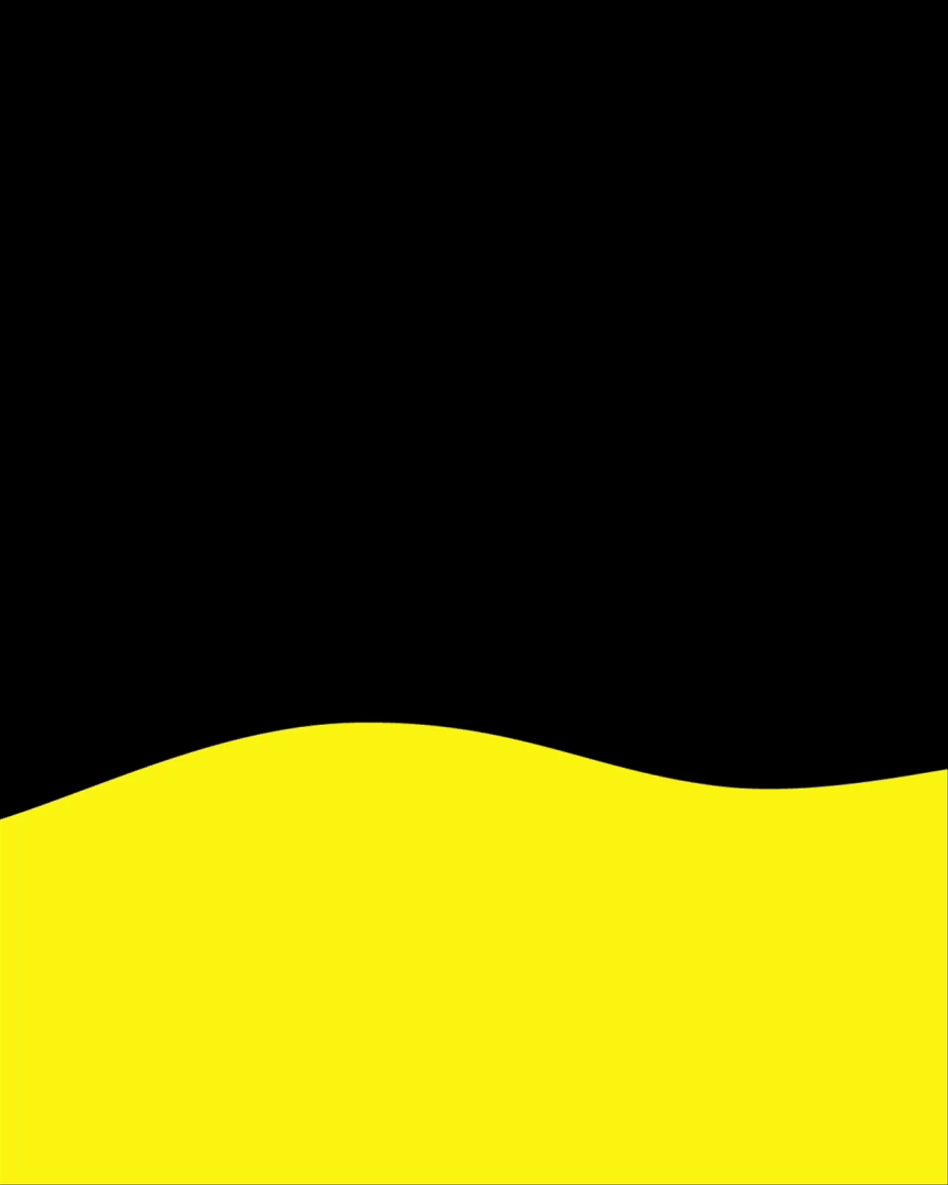
The brand is composed of two primary visual elements. The first, inspired by the logo, is a malleable, clay-like motif that serves as an interactive component in digital applications, further extending the metaphor of boundless creativity. On static applications, this motif rests as a decorative element, providing a dynamic yet grounded visual connection to the brand's ethos.
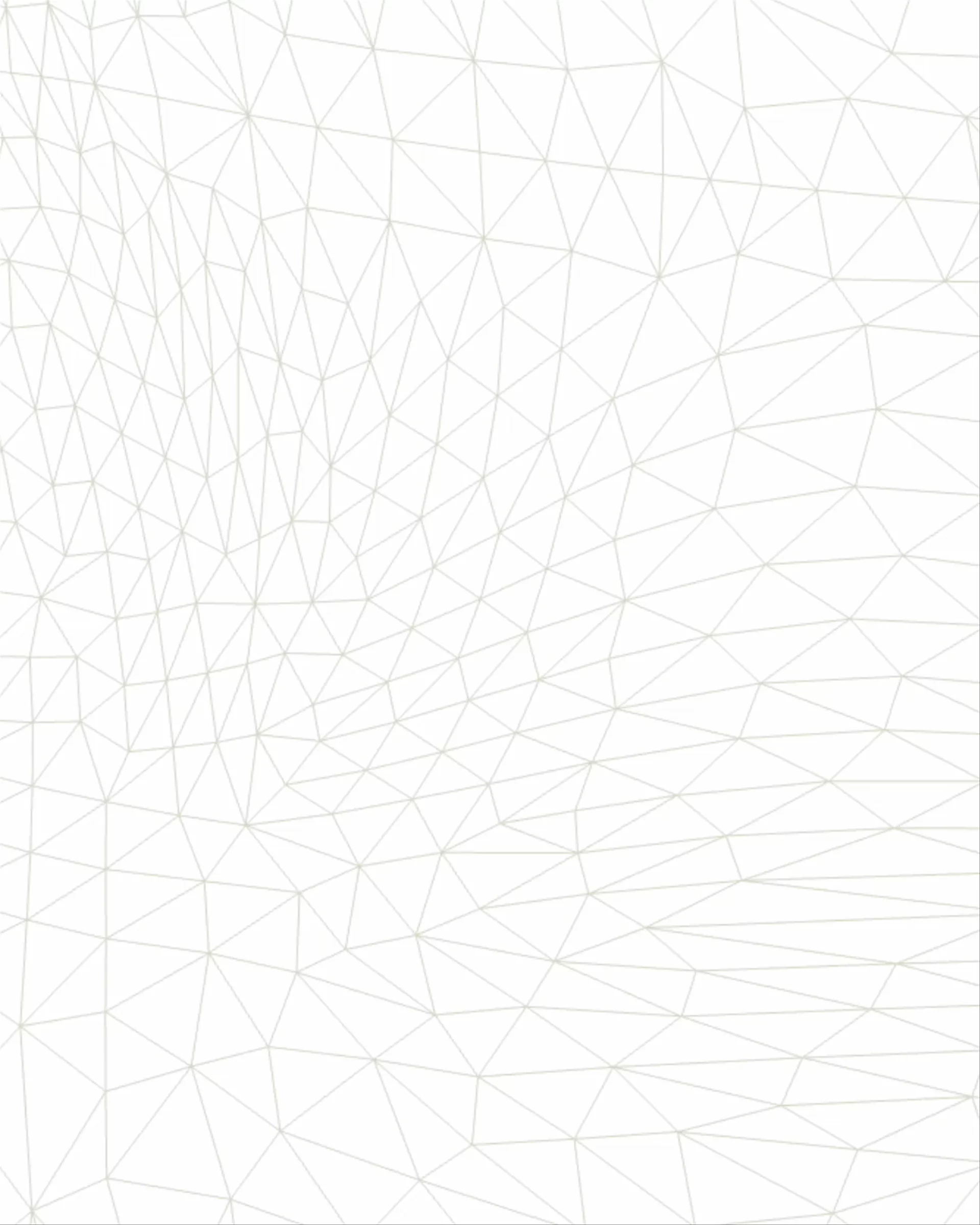
The second element, a 3D wireframe-inspired motif, reflects the nature output of Yellow’s products. As wireframes form the skeletal framework before the final layers are applied, they symbolize the infinite possibilities Yellow empowers creators to explore.


Design System

Onsite Standard, a sans-serif font characterized by its distinct horizontal details, introduces a sense of structure and balance to counter the freeform, blobby aesthetic that defines the rest of the identity.

Riccione Serial, an elegant serif reminiscent of Times New Roman—the quintessential typeface of research papers—conveys a sense of research-backed credibility.

Font combinations with the two typefaces.
Applications

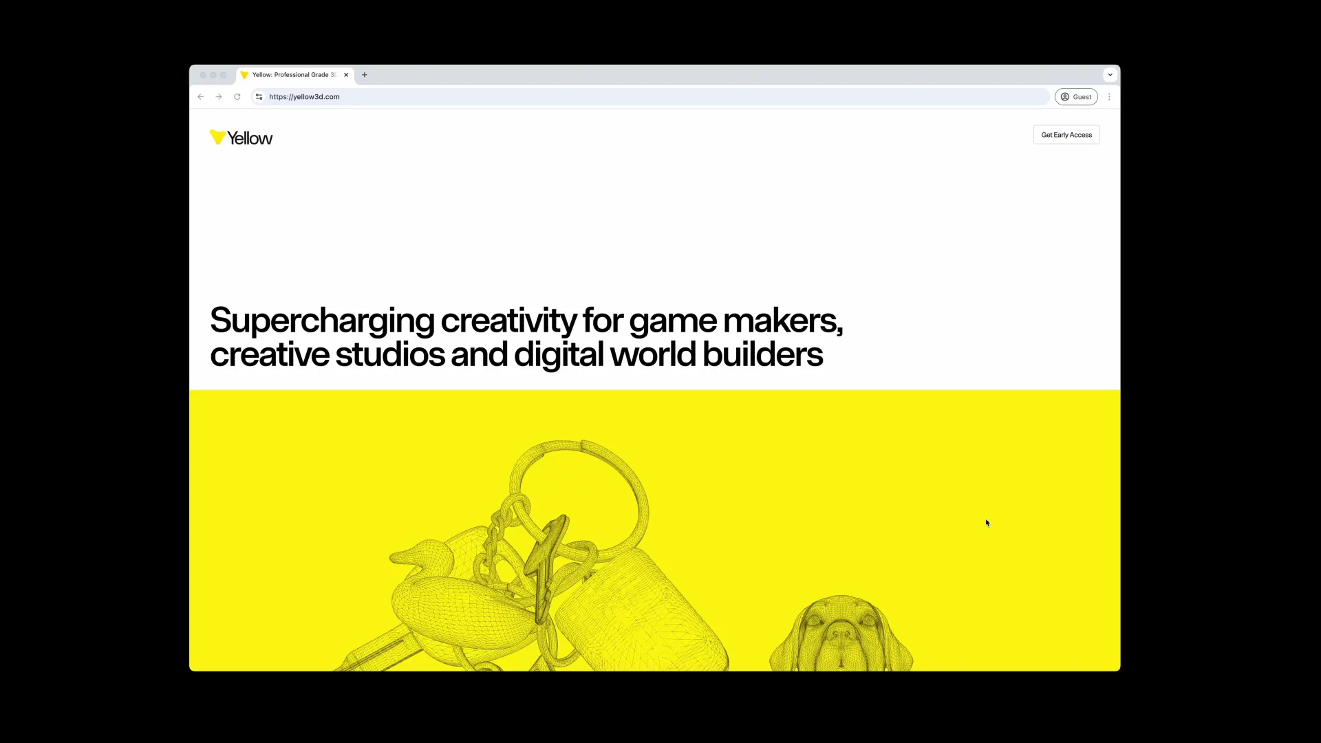


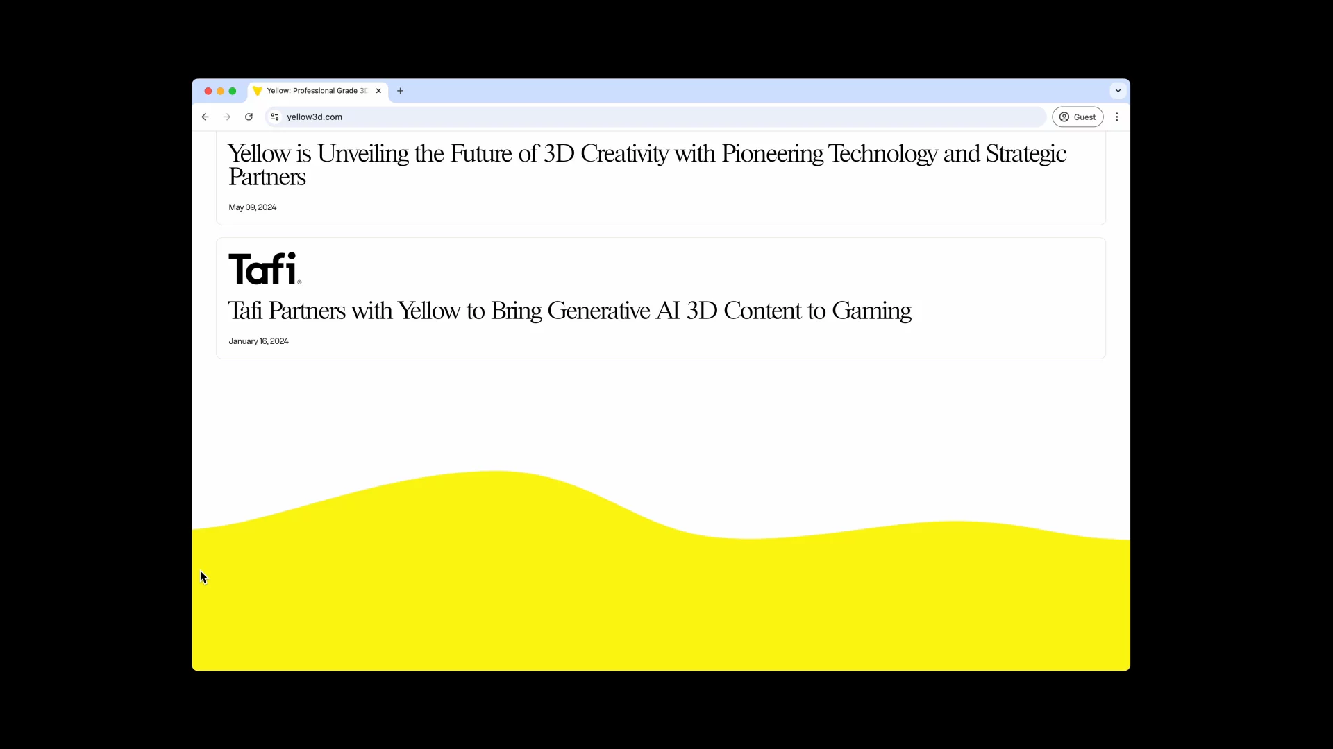

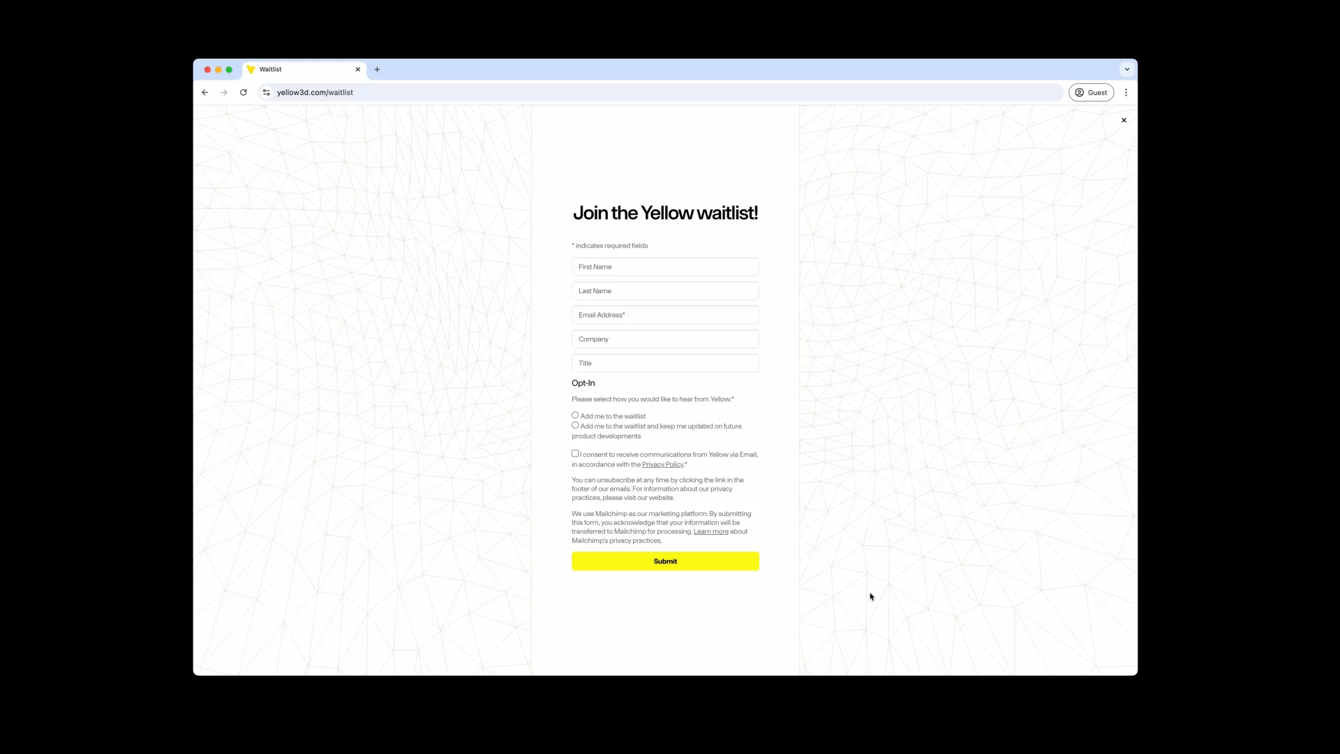


Project Team
- Talia CottonCreative Director
- Chris KimDesigner & Coder
- Jake MasakayanDesigner
- Noah SchwadronDesigner & Coder
- Dear FutureStrategy
